I only used very basic technology in my research as it was much easier to write quick notes and drafts of products on paper and scan them on. I used programmes such as Microsoft to write up these notes and then copied them onto Blogger. This concept is very similar to what large media companies do in order to get as many ideas as possible in a short time. It meant that I could gain research and feedback in order to create a product that would please my target audience.
Planning: I created an animatic as a draft of our music video to show to our target audience for feedback using Imovie on the Apple Macs. I did this by drawing out ideas on a story board sheet, took photos of them using my digital camera and then uploaded them to Imovie. I then added back ground music in to show people what our idea for our final product is.
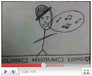
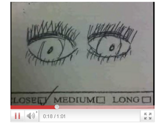
Construction: I used a panasonic camera and tripod when I filmed my music video which was provided the media department at school. Although the technology at school isnt as high-tech as professional media institues use it allowed us to film our work quick as I found the cameras very easy to use and upload the footage to the Imac.
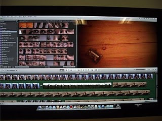
When I edited the clips I used a programme called 'Imovie' which I found relitavely easy to use as I used the old 'Imove' in my AS coursework. The new Imove has a lot more of a variety of effects and transitions to use compared to the old one which made the overall product look much more professional. Using a more advanced technology meant that I could make the film flow a lot more as well. Above is a picture of what Imovie looks like when the film is in the editing stage.
Imovie allowed us to change the speed of the clips which helped to get a romantic feel across at some stages of the song. For example we wanted to create a romantic feeling at the end of the film where Jonny and Emma walk off and therefore used this tool to slow down the speed of the shot. As you can see where it says 'video effect' we could change the colour scheme of each shot which helped us to get a variety of different colours and views across to the audience which made it overall look more interesting and would hopefully keep the target audience interested through the whole song. This also meant that the music video linked in with both the digipack and the advert as they're both black and white themed.
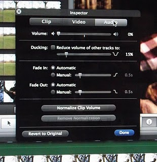
We were able to take the sound away from the clips using the inspector tool so that we had no unwanted background noise in any of the clips which could have ruined the whole video.
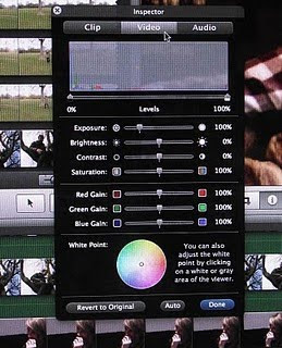
Another thing that we could do was changed the brightness and contrast of clips. This meant that we could make the clips around the same brightness to get more of a flowing effect. It also meant that we could brighten up any dull shots that we filmed. For example we could brighten the shots up that we filmed in the basement.
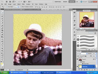
To create a professional look on our digipack we used a programme called 'Photoshop' to edit the images we used. Although we found this quite hard to use as none of us had used it before hand and there were a lot of tools that you could play with. Therefore we only created on one the panels using it and used other programmes such as paint and microsoft word to make the rest of them.
Evaluation: For our evaluation we used the same camera and tripod to film our target audience responses to out music video. We also used screen shots of our music video from the Apple IMac and shots from the editing process to make our evaluations more multimedia and interesting. It also helped to illustrate exactly what we were talking about show a wider response to the questions.

No comments:
Post a Comment