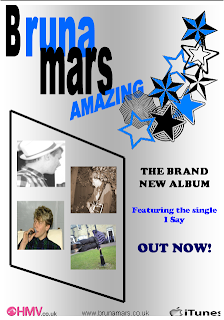
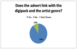
 This is my final magazine advert. Unlike our draft advert we decided to change it and use four pictures rather than just one in order to add some colour to the advert and make it stand out more to our target audience. Emma and I also thought of some other ideas and put them together to come up with this. Our target audience feeback told us that the draft didnt let the artists name stand out enough so I took this in to concideration and made the artists name much bigger and bolder to make sure it stood out the most. We used images of our artist to illusrate the genre of music and also took the photo from the digipack to link them both together. The same stars from the digipack were also used on the post to again link the two products together. I stuck to the same simple colour scheme as I thought it made the product look much more professional rather than just keeping the background plain and white.
Tuesday, 15 February 2011
Final advert
 This is my final magazine advert. Unlike our draft advert we decided to change it and use four pictures rather than just one in order to add some colour to the advert and make it stand out more to our target audience. Emma and I also thought of some other ideas and put them together to come up with this. Our target audience feeback told us that the draft didnt let the artists name stand out enough so I took this in to concideration and made the artists name much bigger and bolder to make sure it stood out the most. We used images of our artist to illusrate the genre of music and also took the photo from the digipack to link them both together. The same stars from the digipack were also used on the post to again link the two products together. I stuck to the same simple colour scheme as I thought it made the product look much more professional rather than just keeping the background plain and white.
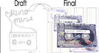
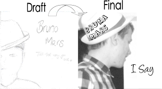
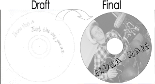
Draft to final digipack
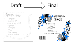
This is the inside cover of the digipack. We used tapes like the draft but put 4 on it lapping over to gain more of a 3D effect. The music video also features a tape at the start and therefore links the digipack and the music video together. We decided not to use the writting on the final product as when we were making it we found out that it didnt look as good as the draft and therefore used a shadowing kind of effect instead to make it look more professional and makes the main tape stand out. We used a blue, orange and yellow background because we they are quite neutral colours and fit in with the rest of the digipack.
For the front cover we kept the same simple affect as the draft. The only think we change was the positioning of the artist. Instead of standing face on we used a photo from the side and could then use his hat as a base for the artists name which makes the overall product look more professional. We kept the front of the digipack black and white as when we looked at our mood board for this genre it seemed that a lot of their album covers were either black and white or neutral colours and these colours seem to be a generic feature. Using black and white also helped the digipack link in with the video as we use black and white affects in it. We changed the name Bruno Mars to Bruna Mars because of copy right reasons and also names the album I say as it is a frequent line in the song 'Just the way you are'.
We changed the disk and added another picture on it as some people from our target audience feedback said that they think another image is needed. By adding this image it makes the CD look more exciting and links in well with the rest of the digipack and advert.
Planning and preperation
Equipment: We booked out equiptment to film - including a panasonic camera and a tripod, and also had a tape from the media department in school to record our video on. We planned to use the tripod for the majority of the time to enable us to get a steady shot whilst filming, however we also planned to use tracking shots with a moving camera so the tripod would not be nescessary for this.
Location: We planned to record some of the video at Jonny's house - our male singer in the music video, and also use shots from outside in the back field area at school as this provided a big quiet open space where we knew we could get permission to film. We also gained permission from Jonny and his parents to use thier house as a set for filming.
Shooting Schedule: December 8th - filming at jonny's house, permission gained, no props needed, just i-pod speakers to play the song from.
End of january - beginning of february- Filming parts outside at school when we all have a study lesson/ free break time together, we just need to make sure it wont disrupt any outdoor P.E lessons or anything else.
Song title and artist name: As a final part of planning for our print products - digipack and advert, we had to change the name of our artist and chosen song title as part of copyright laws, therefore we made a subtle change from Bruno Mars to Bruna Mars and instead of using the existing song title of 'Just the way you are,' we changed it to 'I say' which are lyrics used multiple times in the song, and we also thought these lyrics were specifically relevant and a good choice for the title because it reflects how the song is about what the artist is thinking and saying about the female in the video:
'But every time she asks me do I look okay
I say
When I see your face
There's not a thing that I would change
Cause you're amazing
Just the way you are'
Monday, 14 February 2011
Production: Directors pitch
Name of Artist: Bruno Mars
Title of track: Just The Way You Are
Genre: Pop
Target Audience: Male and female, aged mainly 16-35
Outline of ideas:
The music video is based in one room of a house - a romantic setting where the artist is singing the lyrics to a female - this reflects what the song is about. We plan to mirror this idea with the male singing to the female, but maybe use more of a variety of settings - possibly out side, but still keep the romantic look to it. The music video also uses an aspect of animation which we may try and re create with a stop start motion sequence.
Intertextual References?
Our music video is mainly just going to be based on the lyrics of the song - the lyrics will almost decribe the visuals.
Locations?
Our main location will be in and around one of our houses - as the actual music video is based inside a house, with some scence maybe in outside rural areas such as in an open public park area.
What resources are needed?
We wont need much other resources apart from the video camera and settings to film, but we may incorporate a shot of the lead male playing a piano/ keyboard - similar to the existing music video, and also use a microphone so these resources will be needed.
Key shots and any special features
The planned stop start motion sequence is a special feature we plan to incorporate. Main shots will include over the shoulder shots from the female onto the male singing to her, and point of view shots from both the male and female.
Justification of ideas in relation to genre and artist
I believe the ideas reflect the genre well as they are happy and uplifting - much like the upbeat happy style of pop music, with the romantic feel representing Bruno Mars as an artist through his lighthearted but passionate lyrics.
Advert draft questionnaire
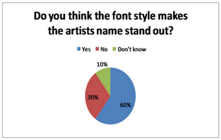
60% of the people we asked said that they thought the font style makes the artists name stand out and 30% said that it didnt. Therefore we could make the writting a bit bolder in order to please the other 30% of our target audience. This question also links in to question 4 where people said the font was good but could be slighty larger to make it stand out more.
Sunday, 13 February 2011
Research: Artist mood board
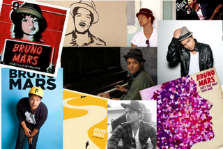 I found it beneficial to construct a moodboard of the artist who produced my final song choice in order to use some of the generic features that are also used in his products. This mood board conveys the strong use of different colours through out the album covers and photos shoots which shows me that when it comes to producing the final product I should use a variety of colours and shots of the artist to get a professional finish. Through this I can also see the Bruno Mars wears a lot of hats and therefore I will make my artist wear one as well to keep to the theme of the songs and genre of music.
Basic music video analysis

http://www.youtube.com/watch?v=EkHTsc9PU2A

http://www.youtube.com/watch?v=k6M5C-oKw9k


