These were the results that we got:
The results were very close with only a 1 person difference between liking the close up draft and the long shot draft. Therefore when it comes to making it we can have a open choice on which one we would like to use.


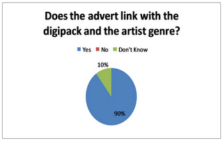
90% of the people said that they think the advert links with the digi pack and the artist genre. However the 10% that said that they didnt know was because they were not sure if the artist fits in with the artist and the digipack.

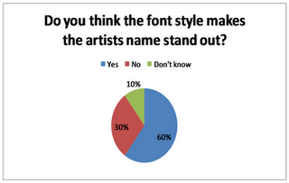
60% of the people we asked said that they thought the font style makes the artists name stand out and 30% said that it didnt. Therefore we could make the writting a bit bolder in order to please the other 30% of our target audience. This question also links in to question 4 where people said the font was good but could be slighty larger to make it stand out more.


No comments:
Post a Comment