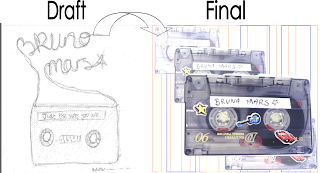
This is the inside cover of the digipack. We used tapes like the draft but put 4 on it lapping over to gain more of a 3D effect. The music video also features a tape at the start and therefore links the digipack and the music video together. We decided not to use the writting on the final product as when we were making it we found out that it didnt look as good as the draft and therefore used a shadowing kind of effect instead to make it look more professional and makes the main tape stand out. We used a blue, orange and yellow background because we they are quite neutral colours and fit in with the rest of the digipack.

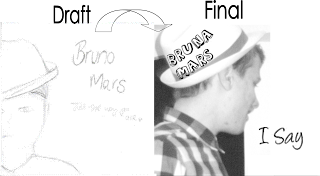
For the front cover we kept the same simple affect as the draft. The only think we change was the positioning of the artist. Instead of standing face on we used a photo from the side and could then use his hat as a base for the artists name which makes the overall product look more professional. We kept the front of the digipack black and white as when we looked at our mood board for this genre it seemed that a lot of their album covers were either black and white or neutral colours and these colours seem to be a generic feature. Using black and white also helped the digipack link in with the video as we use black and white affects in it. We changed the name Bruno Mars to Bruna Mars because of copy right reasons and also names the album I say as it is a frequent line in the song 'Just the way you are'.

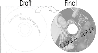
We changed the disk and added another picture on it as some people from our target audience feedback said that they think another image is needed. By adding this image it makes the CD look more exciting and links in well with the rest of the digipack and advert.

No comments:
Post a Comment